Older blog entries for danstowell (starting at number 83)

Rapists know your limits

There's a poster produced by the UK government recently that says:

1 in 3 rape victims have been drinking. Know your limits.

I can imagine there are people in a design agency somewhere trying to think up stark messages to make the nation collectively put down its can of Tennents for at least a moment, and it's good to dissuade people from problem drinking. But this is probably the most blatant example I've ever seen of what people have been calling "victim blaming".

If your friend came to you and said they'd been raped, would you say "You shouldn't have been drinking"? I hope not. And not just because it'd be rude! But because even when someone is a bit tipsy, it's not their fault they were raped, it's the rapist's fault.

It sounds so pathetically obvious when you write it down like that. But clearly it still needs to be said, because there are people putting together posters that totally miss the point. They should also bear in mind that a lot of people like to have a drink on a night out, or on a night in. (More than half of women in the UK drink one or two times a week, according to the 2010 General Lifestyle Survey table 2.5c) So it's actually no surprise AT ALL that 1/3 of rape victims have been drinking. What proportion of rape victims have been smoking? Dancing? Texting?

(By the way there's currently a petition against the advert.)

On the other hand, maybe it's worth thinking about the other side of the coin. People who end up as convicted rapists - some of them after a fuzzy night out or whatever - how many of them have been drinking? Does that matter? Yes, it matters more, because rape is an act of commission, and it seems likely that in some proportion of rapes a person went beyond reasonable bounds as a result of their drinking.

So how about this for a poster slogan:

1 in 3 rapists have been drinking. Know your limits.

(I can't find an exact statistic to pin down the number precisely - here I found an ONS graph which tells us in around 40% of violent crimes, the offender appears to have been drinking. So for rape specifically I don't know, but 1 in 3 is probably not wide of the mark.)

So now here's a question: why didn't they end up with that as a slogan? Is it because they were specifically tasked with cutting down women's drinking for some reason, and just came up with a bad idea? Or is it because victim-blaming for rape just sits there at a low level in our culture, in the backs of our minds, in the way we frame these issues?

Syndicated 2014-07-23 03:20:54 (Updated 2014-07-23 03:22:58) from Dan Stowell

In mainland Britain, you are never more than 34 miles from a pub.

In mainland Britain, you are never more than 34 miles from a pub.

This and other geo-factoids available from my new web service. (I've named it "Feet From A Rat" in tribute to this hoary old urban legend.)

Syndicated 2014-06-08 17:22:51 (Updated 2014-06-08 17:24:12) from Dan Stowell

18 Mar 2014 (updated 6 Aug 2014 at 12:20 UTC) »

I have been awarded a 5-year fellowship to research bird sounds

I've been awarded a 5-year research fellowship! It's funded by the EPSRC and gives me five years to research "structured machine listening for soundscapes with multiple birds". What does that mean? It means I'm going to be developing computerised processes to analyse large amounts of sound recordings - automatically detecting the bird sounds in there and how they vary, how they relate to each other, how the birds' behaviour relates to the sounds they make.

zebra finches

Why it matters:

What's the point of analysing bird sounds? Well...

One surprising fact about birdsong is that it has a lot in common with human language, even though it evolved separately. Many songbirds go through similar stages of vocal learning as we do, as they grow up. And each species is slightly different, which is useful for comparing and contrasting. So, biologists are keen to study songbird learning processes - not only to understand more about how human language evolved, but also to help understand more about social organisation in animal groups, and so on. I'm not a biologist but I'm going to be collaborating with some great people to help improve the automatic sound analysis in their toolkit - for example, by analysing much larger audio collections than they can possibly analyse by hand.

Bird population/migration monitoring is also important. UK farmland bird populations have declined by 50% since the 1970s, and woodland birds by 20% (source). We have great organisations such as the BTO and the RSPB, who organise professionals and amateurs to help monitor bird populations each year. If we can add improved automatic sound recognition to that, we can help add some more detail to this monitoring. For example, many birds are changing location year-on-year in response to climate change (source) - that's the kind of pattern you can detect better when you have more data and better analysis.

Sound is fascinating, and still surprisingly difficult to analyse. What is it that makes one sound similar to another sound? Why can't we search for sounds as easily as we can for words? There's still a lot that we haven't sorted out in our scientific and engineering understanding of audio. Shazam works well for music recordings, but don't be lulled into a false sense of security by that! There's still a long way to go in this research topic before computers can answer all of our questions about sounds.

What I am going to do:

I'll be developing automatic analysis techniques (signal processing and machine learning techniques), building on starting points such as my recent work on tracking multiple birds in an audio recording and on analysing frequency-modulation in bird sounds. I'll be based at Queen Mary University of London.

I'll also be collaborating with some experts in machine learning, in animal behaviour, in bioacoustics. One of the things on the schedule for this year is to record some zebra finches with the Clayton Lab. I've met the zebra finches already - they're jolly little things, and talkative too! :)


Syndicated 2014-03-18 04:11:35 (Updated 2014-08-06 07:55:14) from Dan Stowell

17 Mar 2014 (updated 19 Mar 2014 at 13:15 UTC) »

How long it takes to get my articles published - update

Here's an update to my own personal data about how long it takes to get academic articles published. I've also augmented it with funding applications too, to compare how long all these decisions take in academia.

It's important because often, especially as an early-career researcher, if it takes one year for a journal article to come out (even after the reviewers have said yes), that's one year of not having it on your CV.

So how long do the different bits take? Here's a bar-chart summarising the mean durations in my data:

The data is divided into 3 sections: first, writing up until first submission; then, reviewing (including any back-and-forth with reviewers, resubmission etc); then finally, the time from final decision through to publication.

Firstly note that there are not many data points here, so for example I have one journal article that took an extremely long time after acceptance to actually appear, and this skews the average. But it's certainly notable that the time spent writing generally is dwarfed by the time spent waiting. And particularly that it's not necessarily the reviewing process itself that forces us all to wait - various admin things such as typesetting seem to take at least as long. Whether or not things should take that long, well, it's up to you to decide.

Also - I was awarded a fellowship recently, which is great - but you can see in the diagram, that I spent about two years repeatedly getting negative funding decisions. It's tough!

This is just my own data - I make no claims to generality.

Syndicated 2014-03-17 15:23:03 (Updated 2014-03-19 09:11:29) from Dan Stowell

Python scipy gotcha: scoreatpercentile

Agh, I just got caught out by a "silent" change in the behaviour of scipy for Python. By "silent" I mean it doesn't seem to be in the scipy 0.12 changelog even though it should be. I'm documenting it here in case anyone else needs to know:

Here's the simple code example - using scoreatpercentile to find a percentile for some 2D array:

import numpy as np
from scipy.stats import scoreatpercentile
scoreatpercentile(np.eye(5), 50)

On my laptop with scipy 11.0 (and numpy 1.7.1) the answer is:

array([ 0.,  0.,  0.,  0.,  0.])

On our lab machine with scipy 13.3 (and numpy 1.7.0) the answer is:

0.0

In the first case, it calculates the percentile along one axis. In the second, it calculates the percentile of the flattened array, because in scipy 12 someone added a new "axis" argument to the function, whose default value "None" means to analyse the flattened array. Bah! Nice feature, but a shame about the compatibility. (P.S. I've logged it with the scipy team.)

Syndicated 2014-02-14 08:37:38 (Updated 2014-02-14 08:38:35) from Dan Stowell

7 Feb 2014 (updated 8 Feb 2014 at 20:14 UTC) »

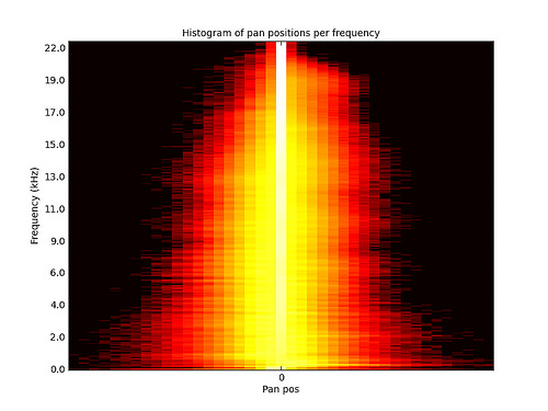
How to analyse pan position per frequency of your sound files

Someone on the Linux Audio Users list asked how they could analyse a load of FLAC files to work out if it was true for their music collection, that bass frequencies below about 150 Hz (say) tended to be centre-panned. Here's my answer.

First of all, coincidentally I know that Pedro Pestana published a nice analysis of exactly this phenomenon, at the AES 53rd conference recently. He actually looked at hundreds of number-one singles to determine the relationship between panning and frequency in the habits of producers/engineers for popular tracks. The paper isn't open access unfortunately but there you go.

So anyway here's a Python script I just wrote: script to analyse your audio files and plot the distribution of panning per frequency. And here's how it looks when I analyse the excellent Rumour Cubes album:

(Just to stress, this is a simple analysis. It simply looks at the spectral representation of the complete mix, it doesn't infer anything clever about the component parts of the mix.)

See any patterns? The pattern I was looking for is a bit subtle, but it's right down at the bottom below 100 Hz (i.e. 0.1 kHz on the scale): the bass tends to "pinch in" and not get panned around so much as the other stuff.

This analysis of Lotus Flower by Radiohead (by Daniel Jones) shows the effect more clearly.

This is what's generally observed, and widely known in mixing engineer "folklore": pan your bass to the centre, do what you like with the rest. Not everyone agrees on the reasons: some people say it's because the bass can cause the needle to skip out of vinyl records if it's off-centre, some people say it's because we can't really perceive the spatialisation very well at low frequencies, some people say it's just to maximise the energy in the mix. I have no comment on what the reasons might be, but it's certainly folk wisdom for various audio people, and empirically you can test it for yourself by analysing some of your music collection.

NOTE: Code and image updated 2014-02-08, thanks to Daniel Jones (see comments below) for spotting an issue.

Syndicated 2014-02-07 16:41:20 (Updated 2014-02-08 15:13:39) from Dan Stowell

Gaussian Processes: advanced regression with sounds, and with geographic data

This week I was learning about Gaussian Processes, at the very nice Gaussian Processes Winter School in Sheffield. The term "Gaussian Processes" refers to a family of techniques for inferring a smooth surface (1D, 2D, 3D or more) from a set of sampled noisy data points. Essentially, it's an advanced and mathematically very sound type of regression.

Don't get confused by the name, by the way: your data doesn't have to be Gaussian, and Gaussian Process regression doesn't always produce smooth Gaussian-looking results. It's very flexible.

As an example, here's a first pass I did of analysing the frequency trajectories in a single recording of birdsong.

I used the "GPy" Python package to do all this. Here's their GPy regression tutorial.

I do want to emphasise that this is just a first pass, I don't claim this is a meaningful analysis yet. But there's a couple of neat things about the analysis:

  1. It can combine periodic and nonperiodic variation (by combining periodic and nonperiodic covariance kernels). Here I used a standard RBF kernel plus a periodic kernel which repeats every 1 syllable, and another periodic kernel which repeats every 3 syllables, which reflects well the patterning of this song bout.
  2. It can represent variation across multiple levels of detail. Unlike many other regressions/interpolations, sometimes there are fast wiggles and sometimes broad curves.
  3. It gives you error bars, which are derived from a proper Bayesian posterior.

So now here's my second example, in a completely different domain. I'm not a geostatistician but I decided to have a go at reconstructing the hills and valleys of Britain using point data from OpenStreetMap. This is a fairly classic example of the technique, and OpenStreetMap data is almost a perfect for the job: it doesn't hold any smooth data about the surface terrain of the Earth, but it does hold quite a lot of point data where elevations have been measured (e.g. the heights of mountain peaks).

If you want to run this one yourself, here's my Python code and OpenStreetMap data for you.

This is what the input data look like - I've got "ele" datapoints, and separately I've got coastline location points (for which we can assume ele=0):

Those scatter plots don't show the heights, but they show where we have data. The elevation data is densest where we have mountain ranges etc, such as central Scotland and in Derbyshire.

And here are two different fits, one with an "exponential" kernel and one with a "Matern" kernel:

Again, the nice thing about Gaussian Process regression is that it seamlessly handles smooth generalisations as well as occasional patches of fine detail where needed. How good are the results? Well it's hard to tell by eye, and I'd need some official relief-map data to validate it. But from looking at these two, I like the exponential-kernel fit a bit better - it certainly gives an intuitively appealing relief map in central Scotland, and it gives visually a bit less blobbiness than the other plot. However it's a bit more wrong in some places, e.g. an overestimated elevation in Derbyshire there (near the centre of the picture). If you ask an actual geostatistics expert, they will probably tell you which kernel is a good choice for regressing terrain shapes.

The other thing you can see in the images is that it isn't doing a very good job of predicting the sea. Often, we dip down to altitude of zero at the coast and then pop back upwards after. No surprises about this, for two reasons: firstly I didn't give it any data points about the sea, and secondly I'm using "stationary" kernels, meaning there's no reason for the algorithm to believe the sea behaves any differently from the land. This is easy to fix by masking out the sea but I haven't bothered.

So altogether, these examples show some of the nice features of Gaussian Process regression, and, along with the code, that the GPy module makes it pretty easy to put together this kind of analysis in Python.

Syndicated 2014-01-17 07:18:48 (Updated 2014-01-17 07:29:01) from Dan Stowell

OpenStreetMap UK: what should we do this year?

As a contributor to OpenStreetMap, one thing I've been wondering recently is what sort of map data should we collect for the UK, now that the coverage has already got good. Since OpenStreetMap generally has great coverage of the UK, when you're out and about with a printed-out map and a pen, it's very rare that you can find much significant that isn't mapped already - sometimes a new street or a missing church. You could pour your time into mapping increasingly obscure things, whatever you're interested in. But what would be the most useful things to map in the UK, over the coming year? Things that are not just interesting to map but could be practically useful to people? Some thoughts:

  • Addresses. I kind of don't like mentioning this, because I find it boring to map addresses, and I'd much rather that the UK address data magically appeared from some big open-data source. But addresses are obviously really useful for so many things: routing, looking up shops, etc. Coincidentally, Simon Poole (chair of OSM Foundation) also says address collection is the thing we need, for OSM in general not just UK.
  • Postcodes. In the UK postcodes are really important for satnav routing etc. For some reason I suspect that collecting postcodes could be less mind-numbing as collecting addresses, but just as useful. See Jerry's blog about UK postcodes in OSM for an analysis of where we are with postcodes... about 3% of them. As he says, we need to do better than this - so how best to collect them?
  • Footpaths. Really important for planning walking routes, whether in the city or the countryside. We also need to mark when footpaths have steps or are otherwise no good for wheelchairs/prams. (It's also handy to know when footpaths are full-blown rights of way, or just "permissive" access.) In his speech at State Of The Map 2013, Peter Eastern mentioned that they estimated UK footpath data was still pretty incomplete. I often use OSM for planning walking routes - it has loads of footpaths that no other services have, but I do still often go walking somewhere and find new footpaths that aren't in there yet. I don't know how we could specifically push for more footpath mapping - all I will say is please help us and map walking routes :)

Some notes on other things which I'm not sure how vital they are:

  • Buildings. I know when we've been doing London mapping meet-ups, Harry Wood has mentioned that OSM's buildings coverage for London is rather patchy. You can see it on the map - there are pockets full of buildings mapped, and large pockets with none. But... is this a bad thing? What would we want buildings mapped for? I know they're useful in fancy 3D map renderings, but for more practical purposes...? I'm guessing it's not that crucial, though it might relate a bit to the address mapping.
  • Shops. It's great to have shops, restaurants, pubs and other local businesses in OSM. Once you start mapping these, though, you notice there's quite a rapid turnover - your high street probably gains/loses a shop every 3 months or so, at a wild guess. So this data is useful, but it's less permanent than all the other stuff I've mentioned so far. I'd suggest there's no point having a big push to map every shop in every high street, we just need to let the momentum build to a point where that happens under its own steam.
  • Postboxes. Again Jerry has a detailed breakdown, and says we need to map them more. Plus Robert Whittaker has some data mining tools about postbox completeness. On the other hand, is it really that urgent to map postboxes? It doesn't feel anywhere near as critical as mapping addresses, walking routes, etc. The only use case I can think of is "where's the nearest postbox?" which is rarely a critical matter.
  • GPX traces. After MapBox published their beautiful rainbow GPS map tiles which provide a lovely way to see the GPS traces contributed by the community, I noticed at least two villages where there were basically zero traces uploaded. Are GPS traces important to UK mapping? The coverage of the aerial imagery is good, and generally quite well GPS-aligned, so... do we need more GPS traces around the UK? I genuinely don't know, and would be interested to find out either way.
  • Grit bins. Something I noticed a couple of winters ago - it would be really handy to have every grit bin mapped: one day, when it's freezing cold outside, all the grit bins are hidden under a foot of snow, and you need to clear a driveway, it could be really handy. That's just one little thing that I don't think anyone has particularly focussed on, so a little call out - please map amenity=grit_bin when you see them!

I'd be grateful for any feedback on the thoughts above, including other things that could be priorities. Just one UK mapper's perspective.

Syndicated 2014-01-01 13:44:07 (Updated 2014-01-01 13:44:55) from Dan Stowell

18 Dec 2013 (updated 18 Dec 2013 at 23:12 UTC) »

SuperCollider inspired web audio coding environments

SuperCollider is an audio environment that gets a lot of things right in terms of hacking around with multichannel sound, live coding and composing the different structures you need for music.

So it's no surprise that in the world of Web Audio currently being born, various people are getting inspired by SuperCollider. I've seen a few people make pure-JavaScript systems which emulate SuperCollider's language style. So here's a list:

I think there's at least one I've forgotten. Please let me know if you spot others, I'd be interested to keep tabs.

So there are obvious questions: is this a duplication of effort? should these people get together and hack on one system? is any one of them better than the others? I don't know if any of them is better, but one thing I know: it's still very early days in the world of Web Audio. (The underlying APIs aren't even implemented fully by all major browsers yet.) I'm sure some cool live coding web systems will emerge, and they may or may not be based on the older generation. But there's still plenty of room for experimentation.

Syndicated 2013-12-18 12:06:50 (Updated 2013-12-18 17:16:00) from Dan Stowell

Fact check: is it true that 1/3 of GP surgeries fails health standards?

There was an inspection of GP surgeries that came out last week, widely reported/headlined as "one third of GP surgeries" failing basic health standards. So is it true that one third of GP surgeries fails basic standards? No, and for a very simple reason.

The Care Quality Commission surveyed 910 GP surgeries (out of 8000 total) and found failings in one-third of them. But how did they pick the surgeries to inspect? Did they do it at random? No.

"80% were targeted because of known concerns. The remainder were chosen at random."

In other words, this survey was not a survey of all our surgeries, but of the ones that people were already suspicious about. In a sense, it was a survey of the worst of the bunch. When you pick your targets like this, it makes no sense to generalise the result to the rest of the GP surgeries.

What's the true number? Well we don't know. If we make the assume that all the dodgy surgeries were included in the batch of 910, the percentage would be 3.8%. It would be good luck to capture all the dodgy surgeries, though, so probably a bit higher than that. Still something to be concerned about, of course - but no crisis. The UK is still internationally leading in quality and cost effective healthcare so there's no need to panic...

Syndicated 2013-12-17 03:11:39 (Updated 2013-12-17 03:13:11) from Dan Stowell

74 older entries...

New Advogato Features

New HTML Parser: The long-awaited libxml2 based HTML parser code is live. It needs further work but already handles most markup better than the original parser.

Keep up with the latest Advogato features by reading the Advogato status blog.

If you're a C programmer with some spare time, take a look at the mod_virgule project page and help us with one of the tasks on the ToDo list!